Designing meaningful fonts can serve a bigger purpose than branding a company or fulfilling graphic expression. Playful fonts can make us happy, redesigned letters can make things clearer and there’s even a science to unforgettable fonts.
So, let's take a brief departure from Arial, Helvetica and Times New Roman as we dive into fonts that not only please the eye but challenge our perception of the written word.
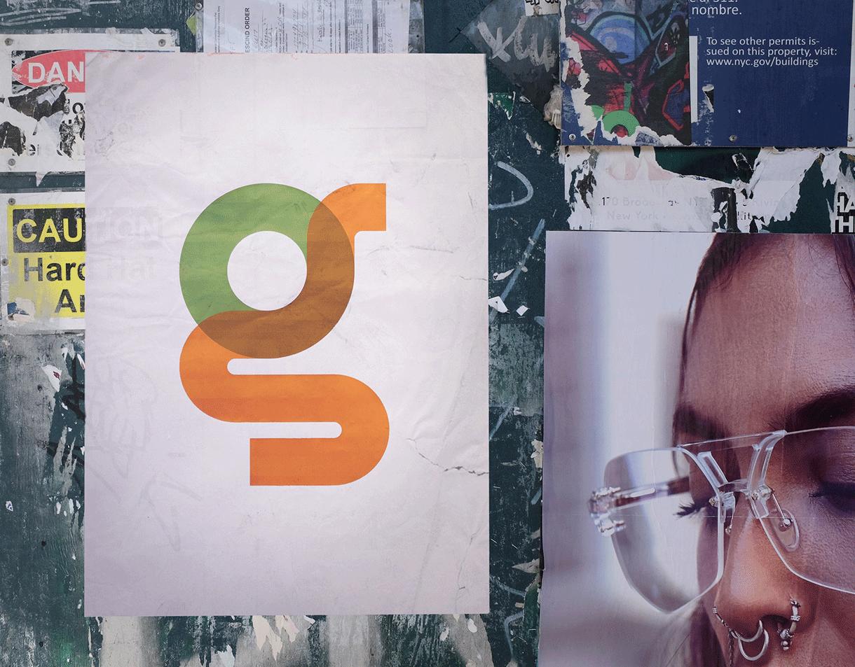
Type with Pride is a celebration of Gilbert Baker, the creator of the Rainbow Flag and the symbol of LGBTQ+ pride. NewFest and NYC Pride partnered with Fontself in creating this aptly titled font ‘Gilbert’. Best of all, this colourful homage to a designer and his powerful legacy is free to download!
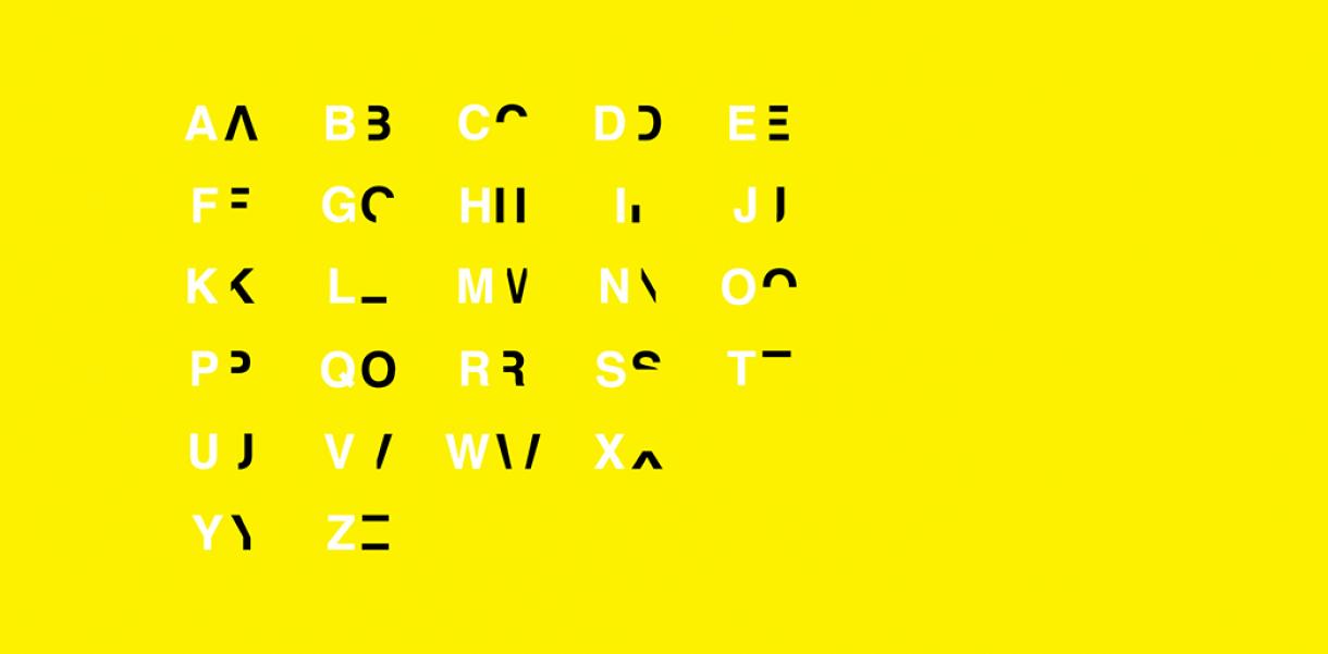
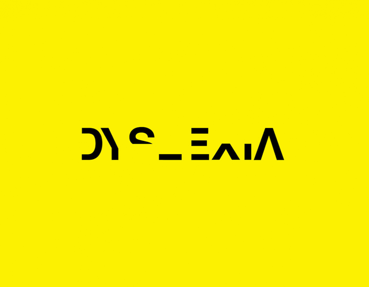
In this next typeface, 40% of each letter is missing to slow down your reading pace – why? The Dyslexia typeface by designer Daniel Britton is made to recreate the feeling of reading with dyslexia. The typeface aims to foster empathy by allowing people to experience the embarrassment and frustration dyslexic people feel every day.
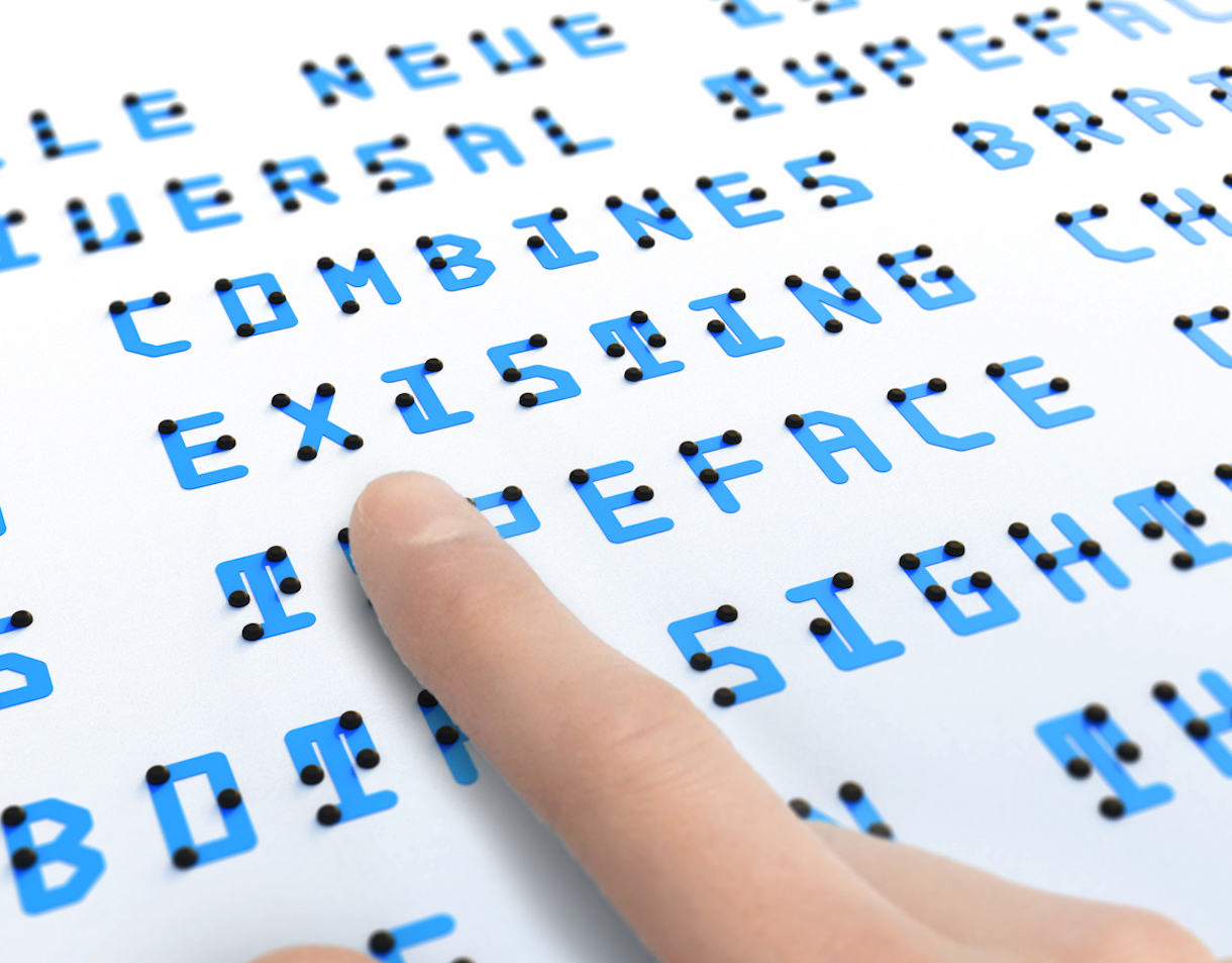
While Dyslexia amputates the alphabet, Index Award 2019 Finalist Braille Neue adds to it. By combining Braille with other alphabets it’s making a new written language that’s understandable for both the sighted and visually impaired. In a world populated by 217 million visually impaired people, this could be the basis of more inclusive communication.
Now, take a break and see how much you remember about these fonts. Some? All? Very little? Had you read it in the Sans Forgetica font, you might have remembered it better. This font created by Melbourne's RMIT University Behavioural Business Lab slants eight degrees to the left and has gaps in the structure of each letter. Making this obstacle in comprehension forces the brain to work harder to decipher the letters. Studies showed that students reading in Sans Forgetica remembered 57% of a written text, compared to those reading in Arial remembering 50%.
