By the time an object, or an apartment, or a company hits the half-century mark, it’s usually been through a redesign or two. Yet the standard-issue amber-cast pharmacy pill bottle has remained virtually unchanged since it was pressed into service after the Second World War. (A child-safety cap was added in the seventies.) An overhaul is finally coming, courtesy of Deborah Adler, a 29-year-old graphic designer whose ClearRx prescription-packaging system debuts at Target pharmacies May 1.
Adler grew up in a family of doctors in Chappaqua, New York, but escaped medicine for an M.F.A. at the School of Visual Arts. She was inspired to return, at least tangentially, after her grandmother Helen accidentally swallowed pills meant for her husband, Herman. The drugstore prescription bottle, it occurred to Adler, is not just unattractive, it’s actually dangerous. Statistics back her up: According to a recent poll conducted for Target, 60% of prescription-drug users have taken medication incorrectly.
For her SVA thesis project, called Safe Rx, Adler revamped the familiar canister, then approached the FDA—but one of Target’s creative directors saw her work last summer, snapped up the patent, and rolled it out in record time. It’s already approaching design-classic status: ClearRx will be included in a MoMA exhibit this October. Your medicine cabinet is next. Here’s how Adler got from A to B.
Step 1, The Industry Standard
Inconsistent labelling.
Every pharmacy’s bottle has a different style and placement of information. At Duane Reade, the drug name appears at the bottom of the label, with the quantity below; at Metro Drugs, the quantity appears before the name of the medication, on the same line.
Branding trumps all.
The first and largest piece of type on a label is often the drugstore’s logo and address—not the name of the drug and instructions on how to take it, which should be given priority.
Confusing numbers.
Numerals are often printed without explanation. The number 10 floating in empty space, for example, could be read as ten pills or “take ten times a day.”
Poor colour combinations.
Colour-coded warning stickers—like those that say take with food, for example—don’t contrast strongly enough with either bottles or text. Black type set against a navy background is hard to decipher. An orange sticker can hardly be read against an orange bottle.
The curved shape is hard to read.
Existing pill bottles have no flat surfaces and are too narrow for an entire label to be visible at once. In order for all pertinent information to be observed, the bottle must be rotated.
Tiny type.
The FDA requires a separate information sheet to be included with all medication. The long lines of tightly spaced type mean it’s usually discarded unread.
Step 2, The Prototype
Function over form.
Adler’s initial sketches had an antique apothecary design. She eventually realized that this approach sacrificed clarity for aesthetics. “People want to know the name of the drug first,” she says, “then how they should take it. But it’s never presented that way.”
Colour coding.
To avoid confusion, the label on each family member’s medication was given a different colour. This concept was later modified owing to the expense of supplying pharmacies with colour printers.
Intelligent expiration.
A Condé Nast security badge that develops a large red X after 24 hours gave Adler the idea to add a similar marker to the label. A version that works over months, not hours, will be ready in 2006.
Shaping the bottle.
After rejecting triangles and squares as too extreme, Adler decided on a D-shape—a wider front and a flat back would be easier to read. It was abandoned owing to the time required to certify the unusual semi-circle cap for child safety.
Info attached.
Full medication details are normally stapled to a paper bag—and thrown away. Adler created grooves on the bottle that would hold a paper card with text set in columns. This plan was altered when the shape changed.
Close reading.
In case the type was too small to read, Adler included a thin magnifying lens. It’s still under consideration.
Intake schedule.
Instructions on when to take medication originally peeked over the top of the bottle. But doctors don’t pinpoint time so precisely, and pharmacists don’t want to be held responsible for such specific directions.
Step 3, The Solution
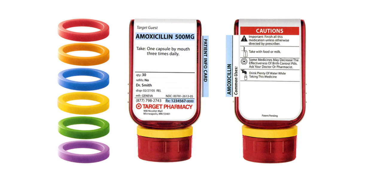
The ClearRx system Adler designed for Target includes bottles for pills and liquids and a measuring syringe.
(1) Easy I.D.
The name of the drug is printed on the top of the bottle, so it’s visible if kept in a drawer.
(2) Code red.
The red colour of the bottle is Target’s signature— and a universal symbol for caution.
(3) Information hierarchy.
Adler divided the label into primary and secondary positions, separated by a horizontal line. The most important information (drug name, dosage, intake instructions) is placed above the line, and less important data (quantity, expiration date, doctor’s name) is positioned below.
(4) Upside down to save paper.
Klaus Rosburg, a Brooklyn-based industrial designer hired by Target, came up with an upside-down version that stands on its cap, so that the label can be wrapped around the top. Every piece of paper in the package adds up to one eight-and-a-half-by-fourteen-inch perforated sheet, which eliminates waste and makes life easier for pharmacists.
(5) Green is for Grandma.
Adler and Rosburg developed a system of six coloured rubber rings that attach to the neck of the bottle. Family members choose their own identifying shade, so medications in a shared bathroom will never get mixed up.
(6) An info card that’s hard to lose.
A card with more detailed information on a drug (common uses, side effects) is now tucked behind the label. A separate, expanded patient-education sheet, designed by Adler, comes with three holes so it can be saved in a binder for reference.
(7) Take “daily.”
Adler avoided using the word once on the label since it means eleven in Spanish.
(8) Clear warnings.
Adler decided that many of the existing warning symbols stuck on pill bottles don’t make much sense—the sign for “take on an empty stomach,” for instance, looked like a gas tank to her—so together with graphic designer Milton Glaser, for whom she now works, she revamped the 25 most important.
Designed by
Deborah Adler & Klaus Rosburg - USA


