Functionality and use of design
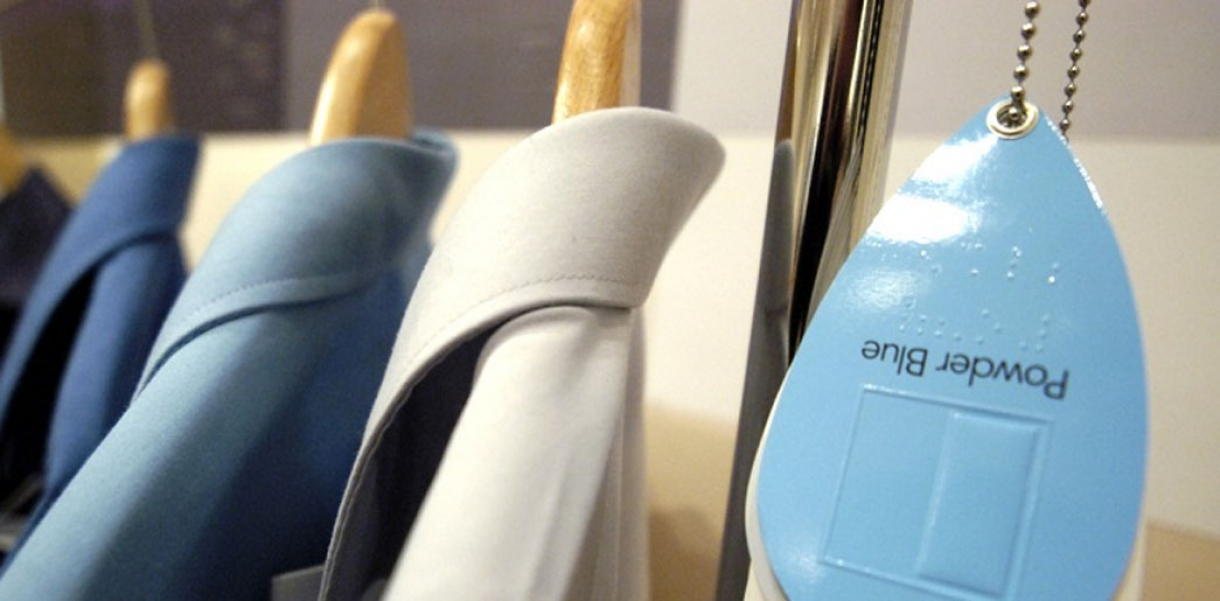
Each core shape is enclosed in a square with a raised key line and represents a color. The inner shape is further sub-divided in four creating four shades of decreasing saturation. The tag also contains tactile information on size with a barcode providing more detailed information. A permanent silk ‘c’ label with the tactile shape is sewn into the garment for long-term-identification.
How did this design improve life?
The ability of visually impaired people to shop independently for clothing has been significantly hampered by their inability to judge the colour of what is on offer. In the past, other colour coding systems have been developed but few are comprehensive or effective either in terms of cost or their ability to describe a wide range of shades. The ‘c’ system has been developed with an understanding of the importance of this and also of the commercial realities that must be addressed if the system is to be adopted. By taking an existing neglected interface that is normally discarded after purchase and transforming it into a valuable medium for information delivery, the design team has offered visually impaired people the possibility of the real independence that they desire as consumers.
Drawbacks of life improvement
None whatsoever
Research and need
The design evolved as a result of intense user input by young visually impaired and with the research support of the Helen Hamlyn Research Centre. It is documented in 'Innovate 5 Can insights on disability help to design better products?' (www.hhrc.rca.ac.uk/programmes/sbp/innovate.html
Designed by
Jade Aloof, David Walsh, Andrew Paterson, Stephen Bell, Philip Stevenson - United Kingdom


