Functionality and use of design
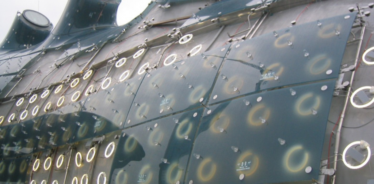
The 930 fluorescent lamps are integrated into the acrylic glass covered "skin" of the Kunsthaus in Graz, Austria. Although connected in a new way, mostly industrial standard products are being used. All lamps can be individually adjusted in their brightness between 0 and 100% at 20 frames/second. Lamps, which show no light, become invisible under the skin.
How did this design improve life?
BIX represents a new approach to create, to work with and to learn to understand media surfaces in architecture and urbanism.
In general BIX is a media façade, but its design ignores many of the key characteristics, which are commonly regarded as inevitable for a ‘modern’ (i.e. state of the art high tech) design. Following an ‘asymmetric’ approach the ability to display color a reasonably high image resolution as well as the homogeneity of a rectangular display matrix has been discarded. A ‘deal’ which in exchange allowed other qualities to be developed. Those are: an extremely economical system that actually allows the creation of large media surface in an actual ‘architectural scale’, a very bright, daylight capable and at the same time highly energy efficient video ‘screen’, a modular system, that is able to adapt and seamlessly integrate into the highly complex shape of the building underneath, and by the deliberate use of ‘old technology’ a highly aging resistant design that doesn’t need frequent hardware updates to maintain its initially envisioned character.
The BIX system becomes part and carrier of the architectural concept in contrast to most conventional video panes, which usually blend over and disguise whatever lies beneath. So one could say: a new system and a new approach that leads to a better “media architecture”. But to do so one needs to know what the term “media architecture” actually contains - and that is what no one really knows today.
Therefore rather than trying to just be a piece of presumably good “media architecture” itself BIX’s intention is also to allow research toward a better understanding of the combination of (static) architecture and dynamically changeable surfaces and structures.
The project tries to provide a cultural training ground on which the coming changes in the field of architecture can be dealt with and where research for basic interaction forms with a variety of new phenomena can take place.
Although it is very coarse and low resolution BIX principally anticipates a future condition when media surfaces as a part of architectural structures become available at a great scale both in size and quantity. That equals: When they become inexpensive enough. By placing BIX in the protected context of an art institution and by avoiding (by inexpensive design) commercial constraints a platform could be realized on which fundamental research can take place realistically.
That fundamental research is bound to cover the first steps moving from the several thousand year old languages of static architecture and design towards the yet vastly unimagined and unexplored architecture of changing, moving and performing structures.
First steps mean to actually discover the most essential vocabulary and syntax for a building to communicate with its surrounding.
Therefore research needs to start at a very basic level because the dominant influence of film and TV makes it difficult to approach the topic other from other angles which do not mean entertainment, action and other form of a high density broadcast. For sure a simple flash of light or a specific glow of light remotely under the skin is more likely to be a useful starting point for a new architectural language than a cartoon character animation.
Drawbacks of life improvement
The BIX project is deliberately staged in a very risky context. Any form of energy is dangerous to play around with and the topic of big screens in an inner city context is connected with lots of money, which accounts for the same.
Fact is: Media surfaces today are a synonym for commercial advertising or political propaganda, none of which are regarded necessarily beneficial for the development of the city as a inhabitable environment. The reason for this is that the high costs of current systems make it necessary to return a lot of money, which only public advertising can do. So if the project fails in its mission to stimulate or support direct research or at least the debate about the importance for design and architecture to integrate the entire topic (rather than outsourcing it to the advertising industry) one could probably see some damage in the fact that now a highly cost effective system has been introduced to cover the urban landscape with yet bigger and more powerful advertising billboards than in the past. (On the other hand it is clear today that the advent of such systems is just a matter of time today.)
Research and need
The BIX project was very much born from a concern that the original architectural concept of the building – namely its key aspect of communicativeness on various levels – would be lost in the implementation planning available in 2001 (two years before completion), when realities united entered the project.
Since there was no budget nor a commission to do something about the then planned in transparent and static appearance of the skin of the building initial research focused on the creation of a maximum of communicative output and robustness with a minimum of a budget.
After conventional fluorescent lamps were identified as promising components further research concentrated on the technical backbone to allow the lamps as pixels to act as fast and precise as possible. In the end only standard industrial components were used which however had never been geared up in that way. The only non-standard part was a water tight lamp casing which does only cover the electrical contacts but not the bulb itself, since aesthetics and spatial constrains demanded a to strip the lamp to a minimum.
Much time went into the design of the lamp matrix where the design of the matrix and the design of suitable media such as low resolution video films had to be developed parallel in an iterative process.
A major part of research went into an area, which is not immediately visible: the software that drives the system. It was designed with an extremely open architecture to provide a variety of input options. Next to stored media files live video can be fed to the system as well as several real time streaming and direct input protocols to allow for instance interactive systems to easily plug into the matrix.
Yet another part was the development of a real time 3D simulator which allows artists to learn to understand how their visual ideas actually become visible under the constraint of the extremely small resolution, the giant size, the extreme geometry of the 2-times curved building surface and the available view perspectives available around the site.
Designed by
Jan Edler & Tim Edler - Germany


