It allows the user to easily manage and visualize digital models or other data in a real context without the need to translate this data in a physical form (i.e.: print, stereo lithography).
Using ARToolkit, an Open Source software component for optical pattern recognition and tracking. Using ARToolkit, an Open Source software component for optical pattern recognition and tracking. Developed by HIT Lab, New Zealand.
Functionality and use of design
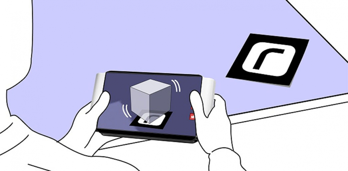
Riquadro is a tangible interface integrating a display and a SW/HW solution for pattern recognition and graphic visualization. The system displays any digital model or graphic overlaid in real-time on a physical icon positioned in the real space.
How did this design improve life?
Riquadro is an advanced interaction design study which focuses on possible ways to improve the way we work with digital information in relation to the real world.
The concept addresses some weak areas in the contemporary design process, regarding the communication between the physical-tangible activity and the digital workflow.
The idea was born from a simple observation.
Design and architecture are activities that are highly depending on the ability, at any time in the workflow, to verify the progression of a project both visually and physically.
The tools that we currently use while designing are more and more virtualized and almost every phase of the process involves the use of digital technology; this certainly gives us an advantage in terms of speed, quality, precision and flexibility, but we always need, at some point, to give our work a physical form. This can happen in many ways; for example, we can print a drawing or get a prototype from a digital model.
Is it possible to handle digital data in a way that is similar to how we interact with real artifacts, but still preserve its digital nature?
The principle behind Riquadro is simple: it consists in a tool that is able to overlay any kind of data from a computer on a real context by showing in real-time, on its display, the digital object naturally “sitting” in real space. The system uses physical icons (small symbols printed on paper) positioned in real space to show the corresponding object and represent it in the correct perspective from the current point of view.
For example, one could see how a virtual model compares to an existing one by simply framing both on the riquadro display. It would also be possible to see the visual impact of new public furniture directly on location, as a digital prototype materialized in a real environment.
Moreover, Riquadro gives the ability to ‘drop’ comments and simple notes on the observed objects. It’s as simple as pointing it towards the object (2D or 3D), choosing the comment and virtually sticking it on space. Anybody who will view that object later, will be able to see the associated comments left by others before.
The integration of an Augmented Reality approach in the area of project data visualization could be a huge improvement on the designer’s workflow, because it would allow at any time to visualize and more importantly to contextualize project data in a very intuitive and natural way.
Riquadro could also bring serious time and economic savings by reducing the need of prototypes and printouts.
Drawbacks of life improvement
None: Riquadro is a very innovative interaction concept based on some of the most interesting recent advancements in pattern recognition technology.
I still see space for improvement on some aspects of the project, even though a lot of effort was put on every aspect of the design, from the research phase to the definition of ergonomic, technical and appearance details.
One possible drawback could be the initial difficulty of integration in the current workflow, because the user should be able to easily and reliably associate data to its corresponding symbol. There would be the need of some middleware to manage the communication between Riquadro and the applications we use most frequently.
As of today, there are affordable solutions to these problems, but of course it’s difficult to imagine which could be the best way to solve them without first practically verifying the concept.
Research and need
The concept for Riquadro was developed on the basis of direct observation of the workflow and methods commonly used in design and architecture studios, paying particular attention to digital data management and visualization;
As a first step I identified common areas in methods and processes that vary slightly across different professional design studios, I then analyzed whether any weakness could be found and which solution could be used to improve the way we interact with our tools during project development.
After direct observation, interviews and research on existing literature I noticed a common deficiency in the way digital data is managed, visualized and analyzed in relation to the physical space where we live and operate.
More precisely, the most evident weakness was identified in the connection of the two operative spaces we use to work in: the digital space and the physical space.
Digital-Physical Communication.
Each one of these “spaces” has its own specific qualities; the digital space is viewed as a super flexible, fast, integrated and precise environment to work in. The physical space is instead much more intuitive and direct and a lot more adept for group work.
When we are working in only one of these two spaces we move relatively fast and use well known methods, but problems arise when we need to put them in communication. Say, for example, the need to print out drawings to comfortably work on paper and make annotations or corrections. Or else the necessity at some stage of the development of a digital 3D model to have a physical prototype for showing it to a client or simply for internal review. I take printing and prototyping as two evident examples of communication between the two spaces, in this case acting as a translation of digital files into physical “real” items.
Contextualization and Tangible Interface.
Digital data, like the 3D models we work on, is often un-contextualized. The object floats isolated in the display and the user doesn’t have any immediate way to view it in the real world, in a natural context.
Also, manipulating an object by using a mouse and a keyboard is far from being a natural gesture for, say, simply looking at it from different angles.
This observation brought me to think of a more human and direct form of interaction; after looking at different possible solutions, I conceived a system based on current Augmented Reality technologies to develop a tool that would be as simple as it is efficient in helping people visualize virtual data naturally and intuitively.
A great effort was also spent on studying the interface functionality, especially the hypothesis of a simple commenting system that gives the possibility to “drop” comments on the observed objects and retrieve them later as needed. This is all done through a touch sensitive area on the display, surrounded by a sharp groove to give a tactile feedback and to better define the three most important active locations on the surface
Designed by
Tommaso Lanza - Italy


