Now more than ever, proper environmental education is an essential to our planet’s long-term survival. However, in many part of the globe, it’s still not considered as important initiative and is dangerously underfunded.
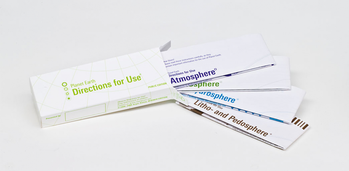
“Environmental protection is human protection,” explained the designers of the Planet Earth – Directions for Use project. “We believe that for every sickness, there is a cure. In this sense, using classical pharmaceutical product design as an inspiration, we created a medicine box in which there are four instruction leaflets”.
Four leaflets folded inside a medicine package provide instructions and suggestions for correct use of our planet. The graphic design communicates the complex themes of environmental protection in a simple, straightforward, and easily understandable way. Behind the project is Neongreen Network, a graphic design agency based in Austria that focuses on ecodesign projects.
The leaflets are divided into the following categories: Atmosphere (air), Biosphere (biomass), Hydrosphere (water), and Lithosphere and Pedosphere (earth).
“‘Unwelcome side effects’ illustrate how sick our planet really is. ‘Special precautions for proper use’ encourages each one of us to find a way of living with as opposed to exploiting our environment and show how easily one can integrate environmental protection into one’s daily life. Continuing along the same design lines, we also discuss the ‘expiry date’ and remind the reader: ‘keep within reach of children.’”
“Because every single one of us counts, Planet Earth—Directions for Use strives to empower the individual entirely in the sense of Mahatma Gandhi: ‘We must be the change we wish to see in the world’. ”
Designed by
Angie Rattay Design - Vienna, Austria.
Website
www.neongruen.net


