AÑO
2017
CATEGORÍA
Aprendizaje y Juego
OBJETIVOS
Educación de calidad
PAL. CLAVE
biodiversity, visualization , knowledge
PAÍS
Norway
CRÉDITOS
Daniel Moran and Keiichiro Kanemoto, from the Norwegian University of Science and Technology and Shinshu University,
LINK
https://www.fastcodesign.com/3066983/infographic-of-the-day/what-you-buy-is-permanently-changing-the-world-heres-how
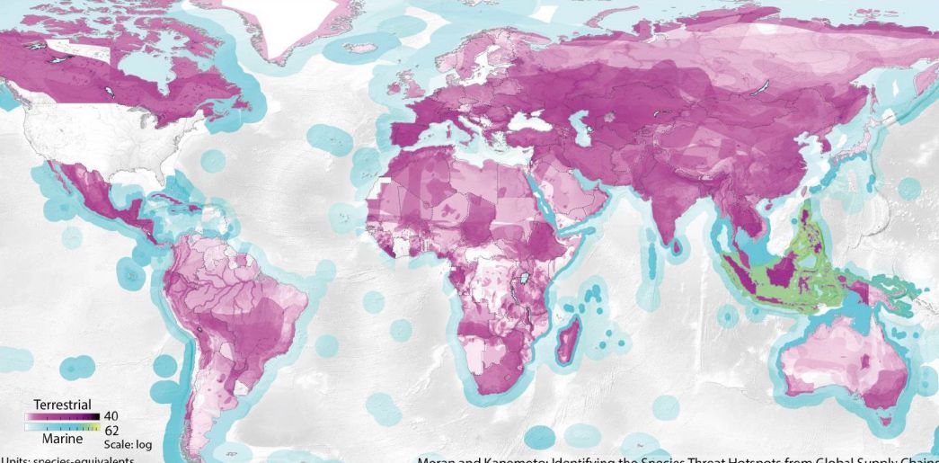
Map of impact of consumption on biodiversity
mapping how consumption impacts vanishing biodiversity on earth.
In a way, it’s the ultimate data design challenge: mapping not only the global economy, but how it impacts vanishing biodiversity on earth. Moran and Kanemoto's work traces local events, like the die-off of a species or an ecosystem, back through the global economic trade network to find its cause. Understanding a single such event is complex; understanding how thousands of them exist in a network sounds impossible. The purple-and-green dappled maps represent how American consumers impact the rest of the natural world. It’s a classic heat map, distinguishing between hotspots of threatened marine and terrestrial species. The more intense the hue, the larger the number of threats that link back to American consumers. their map shows, ecologies in poorer developing countries are often most impacted by global trade routes. Their visualization shows where that conservation should be going, not just where donors can "see" it.