How did this design improve life?
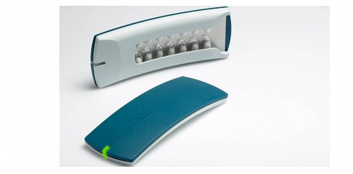
The Helping Hand makes life easier for users of pills. It combines design and functionality in a safe, discrete and elegant way. Protecting, reminding and guiding the user.
Drawbacks of life improvement
From the very beginning of the process, we wanted to create a device for total protection of users. Wanting to create a highly technological device with multiple functions, we started out with a concept of display and buttons.
However, what the target group needed was a device so simple and easy to use that no instructions or manuals would be needed. This was, in fact, a drawback for the innovation process, because we needed to re-think the very concept. Furthermore, we analysed the distribution process and found out that other medical devices are rarely bought. Instead, they are given to users for free when they buy medicine. This, combined with the technical insight on the target group, made us realize that the product had to focus on simplicity, ergonomics, ease of use and low-cost production.
Research and need
The most important finding of the research process was the difference between what is possible to design and what is the right thing to design. We found out that a lot of things were possible, for instance, an indicator on each pill tracking time and use. However, research on ergonomics, research on the target group, market analysis, production analysis, distribution analysis, usability tests and technical research resulted in three simple words: Protect, remind and guide.
Designed by
Designit and Bang & Olufsen Medicom - Denmark


