
When reading non-English languages on a computer, many people encounter “tofu” characters, empty boxes where a computer could not render the intended character. For many languages, native words only exist in physical paper books and cannot be found online by speakers of other languages. This results in a barrier e.g. for many local entrepreneurs who want to take their products to the online market.
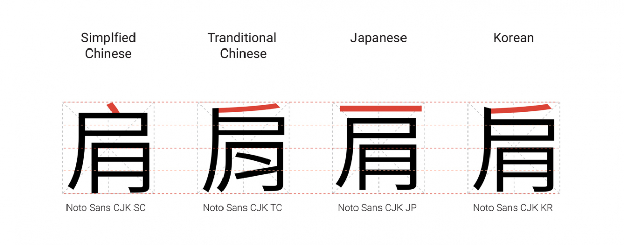
Noto is a free, single typeface family that encompasses more than 800 written languages and scripts. It stands for “NO Tofu” and solves a big usability issue by helping to accommodate for and preserve rarely used or ancient languages. Noto provides harmonious design across languages, including compatible stroke thickness, height, baseline, and typeface style. The current number of Noto fonts is 96.
The first goal for Noto is to create fonts for all devices, but also to keep information alive. When it comes to some of the lesser-used languages, or even the purely academic or dead languages, it is really important to preserve them. Without the digital capability of Noto, it’s much more difficult to preserve that cultural resource. Lastly, the design goal of Noto is to achieve visual harmonization across languages, and if this can be achieved respectfully, the Internet will be a more open place with more possibilities.