We live in a world where everything is hyper-designed: the urban planning of our cities, the interior of our houses, how we interact with our smartphones and, of course, the intangible and invisible designs that allow us access to software and services.
We’re surrounded by spaces designed for a function, products designed with a shape and services designed, sometimes, around needs.
In the near future, design will be everywhere and we’ll be even more surrounded by augmented reality architects and human organ designers that will be very busy designing our future world.
Despite all of this, I still agree with a clever designer who once said that there’s no better designer than nature. When Bruno Munari was asked for an example of good design, he replied: “An orange – an almost perfect object where shape, function and use display total consistency”.
“Orange—The subject is a series of modulated, segmented containers, arranged in a circle around a vertical axis. All these segments are packages with a well-characterised material and colour: fairly hard on the outside and soft on the inside, to protect the outside and the containers. The packaging—as is common nowadays—need not be returned to the manufacturer but can be thrown away. So, this orange is an almost perfect object with absolute consistency between shape, functionality, and consumption. Even the colour is right: blue would be a mistake.”
While there have been many successful designs made by both nature and humankind, it feels as though there’s still one area that lacks hyper design: death and absence.
How can we design for the metaphorical and physical feeling of absence? The relationship between the afterlife and architecture is an ancient one. Of course, this subject is very tied to religion, tradition and culture, some of which changes as fast as we move through time and space. But, if you think about western-world cemeteries, coffins and graves, they’re not so different from 400 years ago.
Innovation and design thinking never really reached the death business. Even though it’s one of the most solid and stable markets. At least in terms of end-users.
Death urgently needs a redesign, says Phineas Harper in his latest opinion column. “When my NikeID trainers are more customised than my funeral will be, you know something is rotten in how we die and mourn. When it comes to death, the final expression of our agency as actors in the world, our choices are so constrained. The right question is why we have so little say in our own deaths.”
“Innovation and design thinking never really reached the death business. Even though it’s one of the most solid and stable markets. At least in terms of end-users.”
So, how can we design for absence and give new meaning to past lives? There is a fine line between religious architecture and commemorative design, as well as designing for absence or building a mausoleum. It’s interesting and inspiring to see how architecture and design can be a tool for remembering someone who’s not here anymore.
As it’s such a deeply personal experience, designing for the loss of a someone else’s loved ones seems almost impossible. However, architecture can still evoke genuine emotions by designing not just for the loved ones left behind, but by creating spaces that evoke the universal feelings of absence and awareness of passing time within everyone.
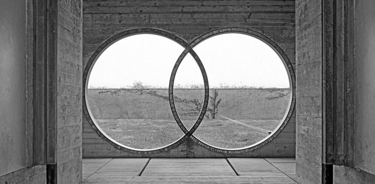
A mausoleum that awakens those feelings for me is the monumental Tomba Brion in San Vito di Altivole by architect Carlo Scarpa. There, you really get the feeling that time has stopped. And even though the memorial was commissioned for a very personal purpose, you still get the feeling that someone or something important is missing and will never come back, while also experiencing a quiet and calm awareness of the end.
Innovation and design thinking never really reached the death business. Even though it’s one of the most solid and stable markets. At least in terms of end-users
So, what could be the future of the cemetery or the next steps for after-life design? I share the sentiments put forward by writer Alexandra Lange:
“Cities of the dead aren’t disconnected from cities of the living but are rather extensions of them. Technology does not separate us from the past; it democratises public memorials, whether in stone or in pixels. As technology advances us toward a life in which both home and office become temporary, time-shared places, people are imagining cemeteries morphing into memory palaces where one can go to see slide shows or to hear podcasts of the deceased. For all their picturesque calm, cemeteries have always been both teeming and empty; the digital version would embrace that contradiction. The design we take personal pleasure from every day is now less likely to be architecture and more likely to be an interface.”


