
b, d, p or q? If you are dyslexic it can be difficult to tell the difference between some letters and changing fonts on the Internet and in books complicate things even further. However, a new typeface designed specifically to help dyslexic people is becoming increasingly popular both online and on print. It is called Dyslexie, designed by Studio Studio and an INDEX: Award 2013 Finalist.
Dyslexia – the difficulty in learning to read or interpret words, letters, and other symbols – is the most common learning disability, affecting nearly 10% of the world’s population. The first description of dyslexia appeared in 1896 by Dr W. Pringle Morgan in Sussex, England, this is what he wrote: “Percy F. aged 14 has always been a bright an intelligent boy, quick at games, and in no way inferior to others of his age. His great difficulty has been – and is now – his inability to learn to read.” In fact, some of the most brilliant minds of our time have been know to have dyslexia: Albert Einstein, Wolfgang Amadeus Mozart, Winston Churchill, and John Lennon.
People with dyslexia are very sensitive to particular typefaces, and readability of a piece of text varies greatly depending upon the font. Christian Boer, of Studio Studio, a Dutch graphic design company, created a dyslexia-friendly font during college in order to help his studies. Supported by a wealth of university research, Boer’s font has been proven to help dyslexics combat the problems they experience when reading, combating issues such as “mirror images of letters, rotating letters, and mixing them up.”
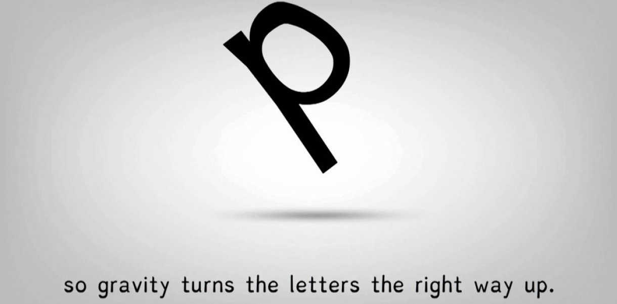
Boer has adapted the alphabet to make it distinctly more readable, by applying a number of techniques: making the bottom part of each letter appear heavier than the top prevents them from turning upside down. Making capitals and punctuation marks bold to highlight the beginning and the end of sentences. And changing the height of similar letters such as v, w, and y, in order to magnify the difference. These are just a few of Typeface Dyslexie’s tricks.
The Typeface Dyslexie is available commercially for the web, word processing, and also in print format. The response has been overwhelming positive, one customer noted: “When I showed [the font] to a colleague who is dyslexic, he actually got emotional, discovering just how easily he could suddenly read the texts.”
http://youtu.be/VLtYFcHx7ec