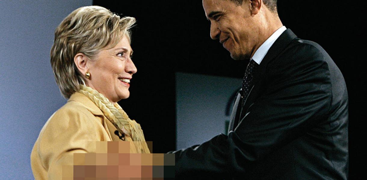
Today, many of us are jaded and have little reaction to provocative images in news media and pop culture, no matter how shocking. But, every now and again, something sticks. Be it a photo in the press, an advertisement, or an artwork. Both tragic or triumphant, these images are burnt into our memories.
While solving critical problems takes a lot more than providing food for thought, messaging can be just as effective as tangible design when it resonates with us emotionally. It can even nudge our behaviour – willfully or subconsciously.
Through clever design and creative vision, we can illuminate issues that are underestimated, misunderstood or completely overlooked simply because people can’t empathise. Even a simple change of context or visual comparison can create entirely new meaning and reach the greater public in unexpected ways.
Here are some of the most potent graphic works and campaigns, focused on real-world issues, that stuck with me personally.
Show Your Stripes
Show Your Stripes, created by Professor Ed Hawkins of the University of Reading, makes climate change undeniably clear with just the use of colour. The graph displays a collection of stripes that begin as various shades of deep blue and progressively turn to a burnt red. More specifically, the ‘warming stripes’ depict the change in temperature as measured in each country over the past 100+ years. The brilliance is in simplicity. No scientific knowledge is needed. You don’t even have to read anything. The message is instantly understood: The world is on fire and we need to act!

An Incalculable Loss
Like climate change, the pandemic garnered its fair share of sceptics – some even claiming it was a government conspiracy to control freedoms. While many of us escaped unscathed (for now), many didn’t. And to showcase this, particularly when many were still in denial, The New York Times printed the obituaries and death notices of 100,000 people on the May 24 (2020) cover. 'Great grandmother with an easy laugh, Marion Krueger, 85, Kirkland, Wash,' one read. The cover encapsulated the massive impact of the virus while providing a very real glimpse into the lives taken.

The portrait of David Kirby
This powerful photograph of dying HIV/AIDS activist David Kirby, embraced by his anguished family, was controversially chosen for a 1992 campaign by clothing brand Benetton. While the intention was to help sensitise public opinion on AIDS, understandably, people were outraged. How could they pair such a tragic and intimate photograph with the sale of sweaters? Focussing on global issues was key to Benetton’s advertising strategy at the time, and Kirby’s family had, in fact, given their permission. As a result, many believe the widespread publishing of the image significantly contributed to the changed perception of HIV/AIDS.

Welcome to America
In June 2021, photographer John Moore shared a photograph of a distraught two-year-old Honduran girl standing alone in the dark while US border control searches her mother. A gut-wrenching image then promptly featured on the cover of TIME magazine. In contrast to the iconic TIME red, then-President Trump towers over the crying girl and between reads: 'Welcome to America'. The cover sought to underscore the Trump administration’s controversial policy to separate families 'illegally' coming into the US, announced just two months before. Shortly after, the policy was rolled back.

Pixelated Truth
While some world leaders only have the power to label any news they don't like as “fake news”, others have much more power over the media. And as we know, censorship isn’t just about keeping information from the public but about distorting views to create new and often harmful narratives. Reporters Without Borders partnered with Memac Ogilvy & Mather in 2012 to create this genius campaign showing how censoring even just a fraction of information can tell a completely different story.

Population by Pixel
A 2008 World Wildlife Fund (WWF) campaign, originally created by Japanese agency Hakuhodo C&D, also brilliantly uses pixels to showcase grim statistics of animals on the brink of extinction. The portrait collection of endangered animals shows the amount left of a particular species as the specific image pixel count. For example, you might be able to make out the faint image of an East African Mountain Gorilla with 325 pixels. But the Javan Rhino, at around 60 pixels (meaning there are only about 60 left on the planet!), is sadly only seen as a handful of green and grey squares.

More horrifying
If you’re of a certain age, Jaws is a movie that likely stuck with you for all the wrong reasons. And unsurprisingly, sharks got an even worse wrap after, despite shark attacks being incredibly rare. Not to mention, we kill an estimated 100M sharks every year. In a plight for our big-fish friends and other animal 'villians', this WWF campaign by DDB & Co. turns our horror into heartbreak. While seeing a fin in the water would be your worst nightmare, surely no fins in the water, ever, would be the worst nightmare – and certainly one more likely to materialise if we don't change.

-
Banner Image: Pixelated Truth, Reporters Without Borders/Memac Ogilvy & Mather


