AWARD YEAR
2017
CATEGORY
Play & Learning
GOALS
Trust, Tolerance & Empathy
KEYWORDS
Big Data, Life vs. Death, Infographics
COUNTRY
United States of America
DESIGNED BY
Nathan Yau - FlowingData
WEBSITE
http://flowingdata.com/mortality/
When and How You Will Die
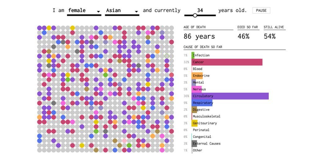
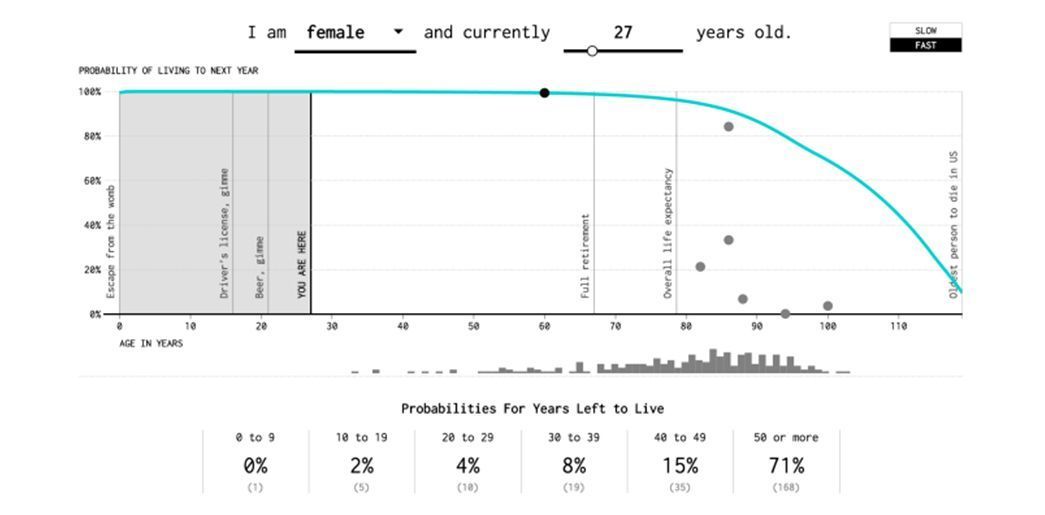
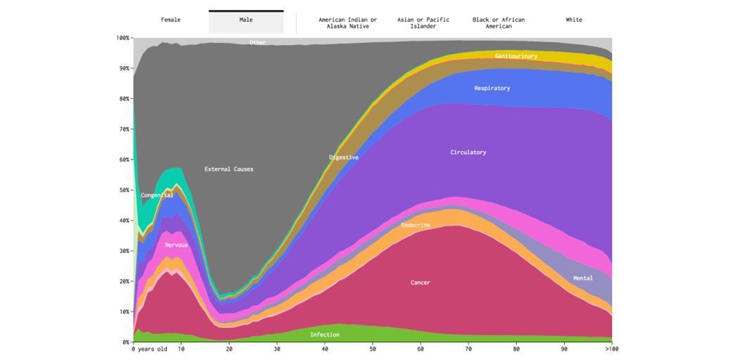
A series of three interactive and animated visualizations that show the uncertainty of life
Death is inevitable, but the circumstances of any person’s pivotal moment of passing on are largely uncertain. When and How You Will Die is a macabre digital experiment that aggregates different demographic variables like gender, age, and average life expectancy. It combines that data with stats on the most common ways to perish (think cancer or congenital disorders), then generates an interactive visualization that predicts the potential cause and timeline for your own personal adios. It’s heavy stuff anchored in data, stats, and simulations that may or may not make you feel better about your impending mortality.
Would knowing your expiring date make you appreciate your life more or less? Either way, this design is starting the discussion, which could lead to people appreciating their waken hours a bit more? Or.. It could just freak the bejeezus out of everybody trying it!?

